By learning about essential photography rules, you’ll know how to create stunning pictures. Visual weight – also known as “balance” – is one of the composition rules you can use to enhance your photos. Let’s look at how understanding visual weight will help you as a photographer.
What is Visual Weight in Photography?
Weight or balance are terms that refer to the visual impact of elements in your composition. The stronger an element’s visual weight, the more it draws in the eye. To achieve a balanced composition, pay attention to the visual weight of the objects. Some objects will have a stronger presence compared to other elements in the frame. You can choose whether to include or remove elements. There are different rules which you can use to balance your image. For example, light and dark areas are simple yet effective ways to create balance. Like other areas of photography, unique images that go against the rules can also work well. But it’s best to learn the rules before you start breaking them!
Types of Weight Balance in Photography
1. Symmetrical Weight Balance
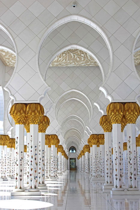
Symmetrical weight is also known as “formal balance”. This is the most obvious way to compose your images. When using this rule, you arrange your most important element in the center of the frame.
Most images that use symmetrical weight balance will be in the horizontal format. This makes it is easier to show the symmetrical elements. The elements don’t need to be exact and perfect. They only need a similar feel in weight and presence, allowing them to appear balanced. In photography, there are four main types of symmetry. You can experiment with vertical, horizontal, radial and reflective symmetry. This visual weight balance is the best choice for photographing architecture and landscapes.
2. Asymmetrical Weight Balance
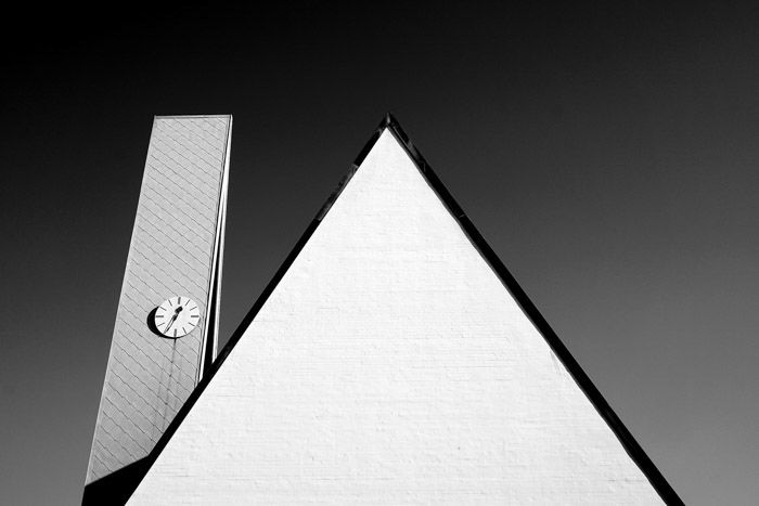
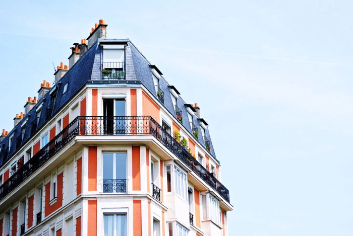
Asymmetrical weight is also known as “informal balance”. This can be tricky to achieve, as it is more natural to favour formal balance. By following the rule of thirds, you will find it is easier to compose your image in this manner. An informal balance helps achieve unique compositions that will grab attention.
If you feel that the scene isn’t balanced, place one or more secondary subjects in the remaining space. For example, the building in the image above could be complemented by a bird or plane in the sky’s negative space.
3. Photography Balance Using Size
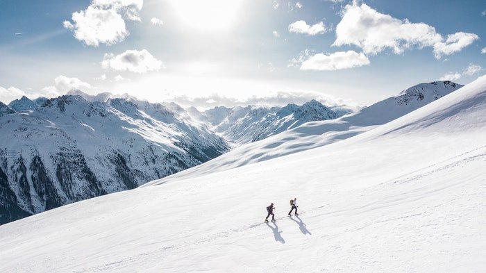
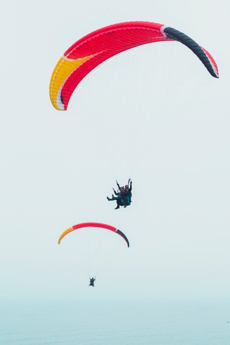
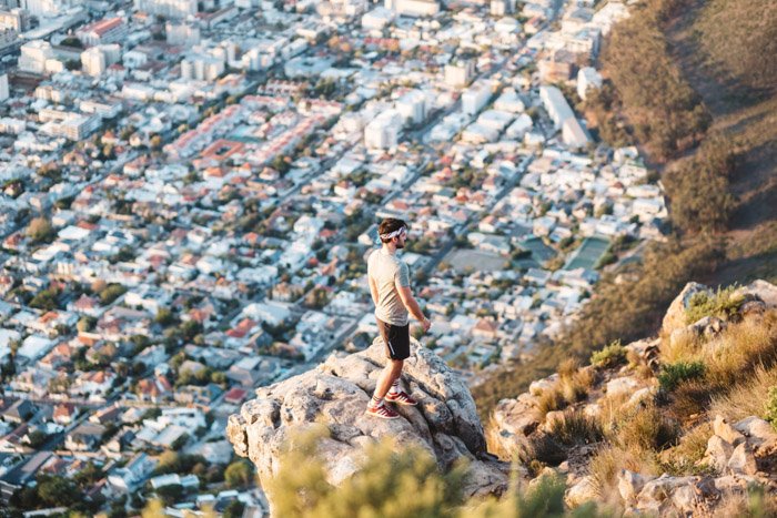
You will find that size is one of the best ways to show a balanced composition. We perceive bigger things to be closer to use, even if this is not always the case. Manipulating this idea can help you to create exciting images.
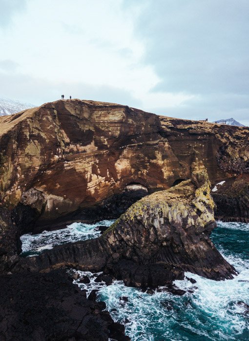
Bigger objects hold more weight than smaller items. Because of this, they will attract the viewer’s attention more. You can do this with your perspective. You can also cut down the distance between you and your main subject. Or you can use the juxtaposition of elements with different sizes. Use this composition tool for landscape, street or architectural photography.
4. Creating Weight Balance With Color and Saturation
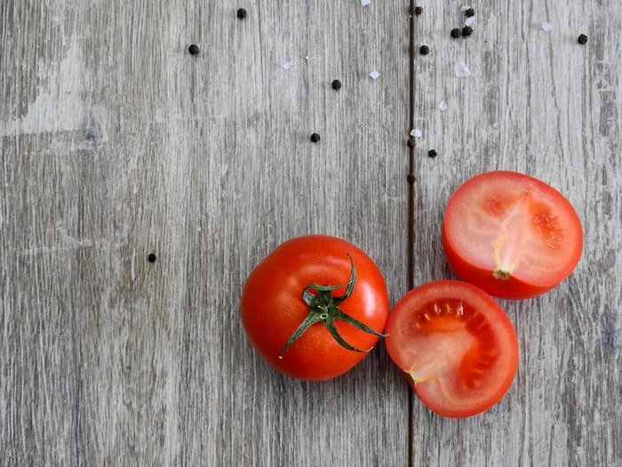
Bold, bright colors stand out more than desaturated ones. A burst of color against a plain, monotone background will grab the viewer’s attention. This allows you to set up the image, forcing attention on one or two objects. Colors can complement each other. So, try having either comparative colors or contrasting colors to help make an image more interesting.
Having similar colors next to each other can help make a fluid transition from one item to another. This can help keep the viewer engaged for longer. This composition tool is useful for portrait, food and landscape photography. It’s also useful to learn a bit about color theory and contrasting colors if you want to master harmonious compositions.
5. Creating Weight Balance With Tone and Contrast
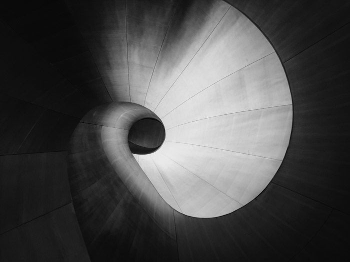
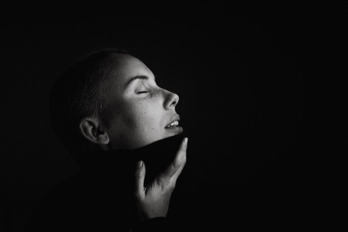
Tone and contrast play a huge part in the photographic process. Darker objects hold more weight than lighter ones. You can use this for the benefit of your photography.
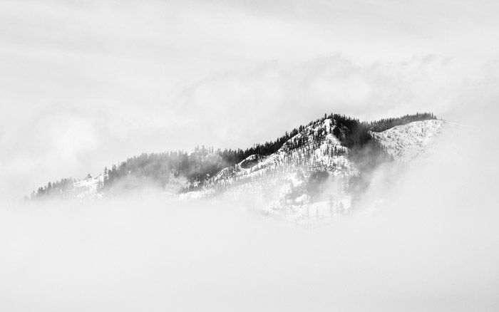
Tone and contrast are very powerful in black and white photography. In B&W photos, the viewers’ focus is on the subject, textures, and patterns instead of the colors. Areas of high contrast draw the eye. Try and capture dark objects on a light background or vice versa. It’s smart to have some detail in the negative spaces to help engage the viewer. This technique is useful in landscape, architecture, and street photography.
6. Focusing on Textures for Different Visual Weights
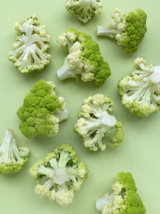
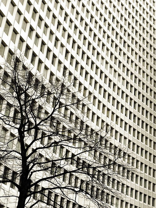
Patterns and textures are interesting as we tend to seek them out and focus on them even without trying. Strong textures can help support an image by balancing an off-center subject. But, textured backgrounds can also detract the viewer’s attention from the main focal point.
Textures can strengthen other compositional rules. The shape and form of both the foreground and background play off each other. Plus, different textures give elements different visual weight. You can use this composition tool in urban, street, landscape and abstract photography.
7. Focal Weight Balance
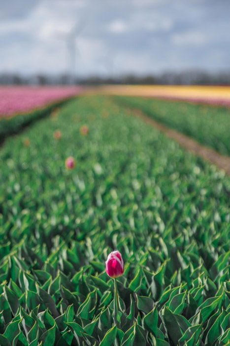
The focus is one way we can force and push the viewer’s attention to an area or subject within our frame. Items in focus will hold more visual weight than those areas out of focus. Shallow depth of field, or differential focus, is a powerful tool to remove any unwanted areas of a scene.
The best thing is that the out-of-focus areas give a useful texture to the composition. They may even be repetitions of what is in focus, which allows the viewer’s eyes to drift towards once they find the in-focus area. Use a shallow depth of field to achieve this effect. Focal weight balance works well in landscape, food, and macro photography.
8. Using Light and Dark For Visual Weight Balance
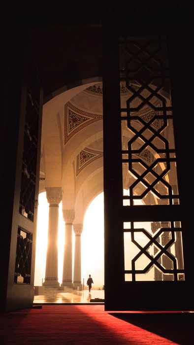
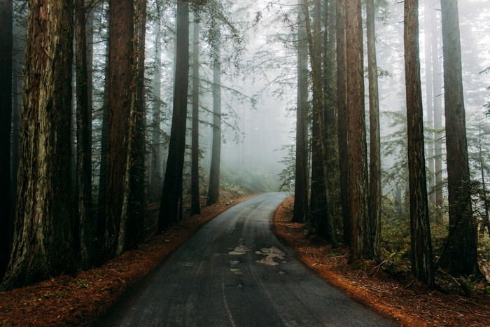
Light and dark are very powerful tools in photography. Every image is a mixture of lights and darks – either whites and blacks or highlights and shadows. A darker image can help to create a moody atmosphere that fits more serious and controversial topics. Conversely, a lighter image can convey a softer, more innocent feel. If you mix these two, you can give different visual weight to certain elements. Also, you can use the light-dark balance to create a narrative for your image.
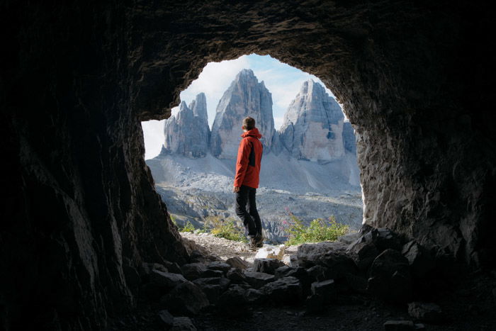
The darker areas draw the viewer’s eyes to the lighter ones. You can use this technique for natural framing, for example. Natural framing is great to create a pull-through effect as the eye tends to follow the lighter areas. You can apply this visual weight tool in almost all photography genres.
9. Including People or Animals For Weight Balance
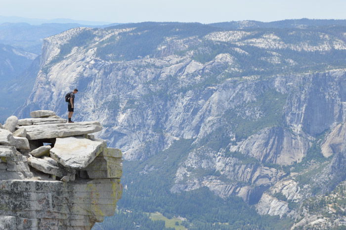
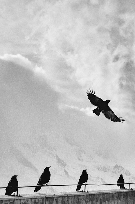
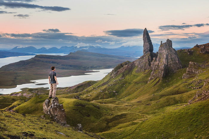
Including people or animals can work well in balancing a composition. They are noticeable subjects that we can quickly identify. So, when they are placed in the image, it gives a sense of scale and helps our interest stay in the frame.
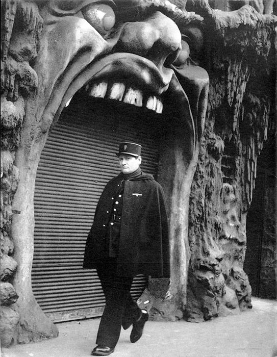
They also give us a sense of place and time due to their placement and surrounding. For example, you can tell that the below image is a humorous one. Without the human element, we would find it scary. Photographing people or animals has the potential to create an interesting image. By using a unique background, you can help the foreground look more attractive. This visual weight technique is a good fit for landscape and street photography.
10. Lead Room Weight Balance
‘Lead room‘ or ‘nose room’ is a concept in photography where you leave space in front of the photographed subject’s gaze. This allows the viewer to see that the person is looking somewhere, and not only at the end of the frame.
We expect to see space in the direction the subject looks. Otherwise, it doesn’t make for a well-composed or balanced image. If you feel that the image is unbalanced, include the object the person is looking towards. It also adds a certain feeling of curiosity to the image. Use the lead room technique for portrait and street photography.
11. Conceptual Weight Balance
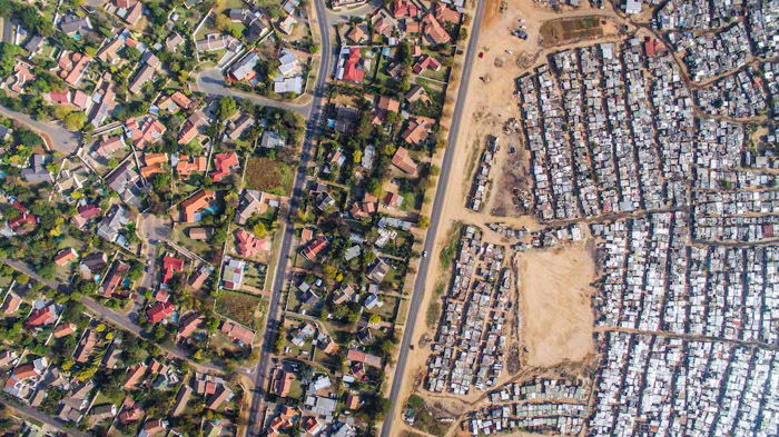
A conceptual idea can be a very powerful tool to create a composition. Juxtapositioning concepts can create a story or interest through the contrast of their ideas. For example, the image below shows the separation of rich and poor neighbourhoods. We can see the size of their houses, how much space they have and even the differences in the landscape.
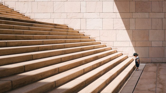
The conceptual ideas behind composition can go from the obvious to thought-provoking. In the image below, we see some steps, and a boy at the bottom, looking at the first step. This represents a challenge that the boy needs to overcome with purpose, effort and courage. They work well as the two contrasting ideas balance off one another. This technique works well for photos that you want to use to evoke emotions and trigger thoughts in the viewer.
Conclusion
There are many ways you can use visual weight in your photography. Try using the rules given in this article one image at a time. If you try to use too many in one image, your composition might become too confused! Instead, experiment with symmetry, size and colors. Then you can move on to the trickier composition ideas.


title: “8 Tips For Using Visual Weight In Photography Composition” ShowToc: true date: “2023-02-02” author: “Harriet Petterson”
By learning about essential photography rules, you’ll know how to create stunning pictures. Visual weight – also known as “balance” – is one of the composition rules you can use to enhance your photos. Let’s look at how understanding visual weight will help you as a photographer.
What is Visual Weight in Photography?
Weight or balance are terms that refer to the visual impact of elements in your composition. The stronger an element’s visual weight, the more it draws in the eye. To achieve a balanced composition, pay attention to the visual weight of the objects. Some objects will have a stronger presence compared to other elements in the frame. You can choose whether to include or remove elements. There are different rules which you can use to balance your image. For example, light and dark areas are simple yet effective ways to create balance. Like other areas of photography, unique images that go against the rules can also work well. But it’s best to learn the rules before you start breaking them!
Types of Weight Balance in Photography
1. Symmetrical Weight Balance
Symmetrical weight is also known as “formal balance”. This is the most obvious way to compose your images. When using this rule, you arrange your most important element in the center of the frame.
Most images that use symmetrical weight balance will be in the horizontal format. This makes it is easier to show the symmetrical elements. The elements don’t need to be exact and perfect. They only need a similar feel in weight and presence, allowing them to appear balanced. In photography, there are four main types of symmetry. You can experiment with vertical, horizontal, radial and reflective symmetry. This visual weight balance is the best choice for photographing architecture and landscapes.
2. Asymmetrical Weight Balance
Asymmetrical weight is also known as “informal balance”. This can be tricky to achieve, as it is more natural to favour formal balance. By following the rule of thirds, you will find it is easier to compose your image in this manner. An informal balance helps achieve unique compositions that will grab attention.
If you feel that the scene isn’t balanced, place one or more secondary subjects in the remaining space. For example, the building in the image above could be complemented by a bird or plane in the sky’s negative space.
3. Photography Balance Using Size
You will find that size is one of the best ways to show a balanced composition. We perceive bigger things to be closer to use, even if this is not always the case. Manipulating this idea can help you to create exciting images.
Bigger objects hold more weight than smaller items. Because of this, they will attract the viewer’s attention more. You can do this with your perspective. You can also cut down the distance between you and your main subject. Or you can use the juxtaposition of elements with different sizes. Use this composition tool for landscape, street or architectural photography.
4. Creating Weight Balance With Color and Saturation
Bold, bright colors stand out more than desaturated ones. A burst of color against a plain, monotone background will grab the viewer’s attention. This allows you to set up the image, forcing attention on one or two objects. Colors can complement each other. So, try having either comparative colors or contrasting colors to help make an image more interesting.
Having similar colors next to each other can help make a fluid transition from one item to another. This can help keep the viewer engaged for longer. This composition tool is useful for portrait, food and landscape photography. It’s also useful to learn a bit about color theory and contrasting colors if you want to master harmonious compositions.
5. Creating Weight Balance With Tone and Contrast
Tone and contrast play a huge part in the photographic process. Darker objects hold more weight than lighter ones. You can use this for the benefit of your photography.
Tone and contrast are very powerful in black and white photography. In B&W photos, the viewers’ focus is on the subject, textures, and patterns instead of the colors. Areas of high contrast draw the eye. Try and capture dark objects on a light background or vice versa. It’s smart to have some detail in the negative spaces to help engage the viewer. This technique is useful in landscape, architecture, and street photography.
6. Focusing on Textures for Different Visual Weights
Patterns and textures are interesting as we tend to seek them out and focus on them even without trying. Strong textures can help support an image by balancing an off-center subject. But, textured backgrounds can also detract the viewer’s attention from the main focal point.
Textures can strengthen other compositional rules. The shape and form of both the foreground and background play off each other. Plus, different textures give elements different visual weight. You can use this composition tool in urban, street, landscape and abstract photography.
7. Focal Weight Balance
The focus is one way we can force and push the viewer’s attention to an area or subject within our frame. Items in focus will hold more visual weight than those areas out of focus. Shallow depth of field, or differential focus, is a powerful tool to remove any unwanted areas of a scene.
The best thing is that the out-of-focus areas give a useful texture to the composition. They may even be repetitions of what is in focus, which allows the viewer’s eyes to drift towards once they find the in-focus area. Use a shallow depth of field to achieve this effect. Focal weight balance works well in landscape, food, and macro photography.
8. Using Light and Dark For Visual Weight Balance
Light and dark are very powerful tools in photography. Every image is a mixture of lights and darks – either whites and blacks or highlights and shadows. A darker image can help to create a moody atmosphere that fits more serious and controversial topics. Conversely, a lighter image can convey a softer, more innocent feel. If you mix these two, you can give different visual weight to certain elements. Also, you can use the light-dark balance to create a narrative for your image.
The darker areas draw the viewer’s eyes to the lighter ones. You can use this technique for natural framing, for example. Natural framing is great to create a pull-through effect as the eye tends to follow the lighter areas. You can apply this visual weight tool in almost all photography genres.
9. Including People or Animals For Weight Balance
Including people or animals can work well in balancing a composition. They are noticeable subjects that we can quickly identify. So, when they are placed in the image, it gives a sense of scale and helps our interest stay in the frame.
They also give us a sense of place and time due to their placement and surrounding. For example, you can tell that the below image is a humorous one. Without the human element, we would find it scary. Photographing people or animals has the potential to create an interesting image. By using a unique background, you can help the foreground look more attractive. This visual weight technique is a good fit for landscape and street photography.
10. Lead Room Weight Balance
‘Lead room‘ or ‘nose room’ is a concept in photography where you leave space in front of the photographed subject’s gaze. This allows the viewer to see that the person is looking somewhere, and not only at the end of the frame.
We expect to see space in the direction the subject looks. Otherwise, it doesn’t make for a well-composed or balanced image. If you feel that the image is unbalanced, include the object the person is looking towards. It also adds a certain feeling of curiosity to the image. Use the lead room technique for portrait and street photography.
11. Conceptual Weight Balance
A conceptual idea can be a very powerful tool to create a composition. Juxtapositioning concepts can create a story or interest through the contrast of their ideas. For example, the image below shows the separation of rich and poor neighbourhoods. We can see the size of their houses, how much space they have and even the differences in the landscape.
The conceptual ideas behind composition can go from the obvious to thought-provoking. In the image below, we see some steps, and a boy at the bottom, looking at the first step. This represents a challenge that the boy needs to overcome with purpose, effort and courage. They work well as the two contrasting ideas balance off one another. This technique works well for photos that you want to use to evoke emotions and trigger thoughts in the viewer.
Conclusion
There are many ways you can use visual weight in your photography. Try using the rules given in this article one image at a time. If you try to use too many in one image, your composition might become too confused! Instead, experiment with symmetry, size and colors. Then you can move on to the trickier composition ideas.
